In this fourth part of our Demystifying Google Analytics 4 series, we move beyond the GA4 interface to look at how you can use your Google Analytics (GA4) data within the Swydo platform. With only months left now before Universal Analytics stops collecting data, getting to grips with GA4 is essential. So why not take advantage of our special offer to all Swydo customers for 10% off each ticket with code ‘SWYDO10’ on our 6-week GA4 Immersion course?

So far in this series, we have focussed solely on working within GA4. We covered how to set up events for tracking GA4 conversions, and then in the previous post, we showed how to customize reports in GA4 to make them more meaningful for your business, which in turn helps you quickly find the data you need to make good decisions.
Now it’s time to move beyond the GA4 interface and look at how to work with your GA4 data within the Swydo platform.
Let’s do this step-by-step.
Crafting GA4 Reports Using Swydo
If you haven’t done so before, it’s quick and easy to connect to your GA4 data within your Swydo account. First, click the “+ New report” button.
This will bring up the report template gallery.
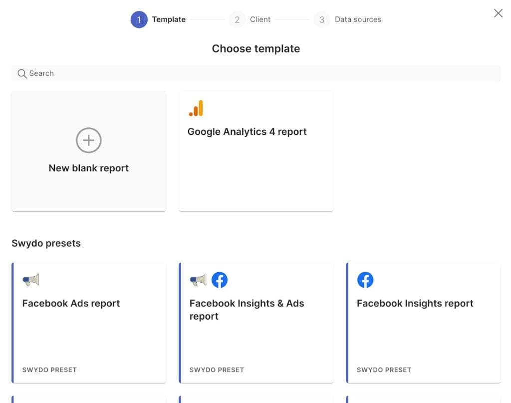
You have two choices here, you can either create a report from scratch (using the “New blank report”) option, or you can use an existing template, e.g., the “Google Analytics 4 report” template. This template is an excellent kickstarter if you’re not sure exactly what you want to include. It can be hard working from a blank canvas, so using the GA4 template gives you something to look at and then add, edit, and remove as you see fit to tailor the report to your specific needs.
However, for the purposes of this article we will start with a blank canvas and run through building a report that shows the performance of some of the events we covered previously.
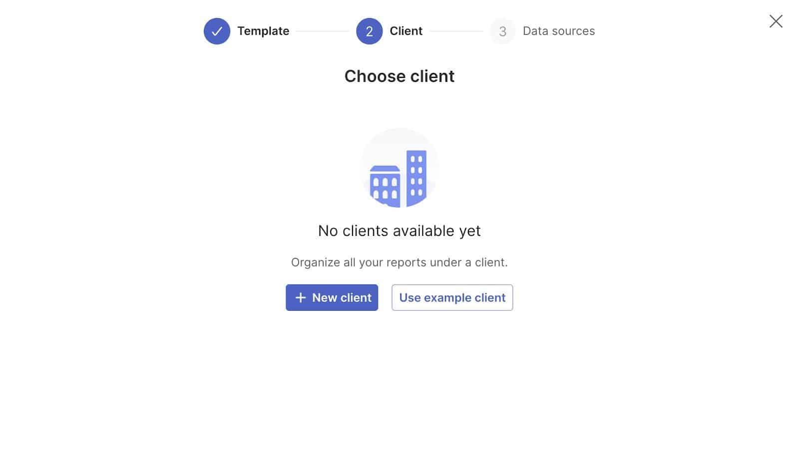
After clicking “New blank report”, we then need to choose a client for this report to sit under.
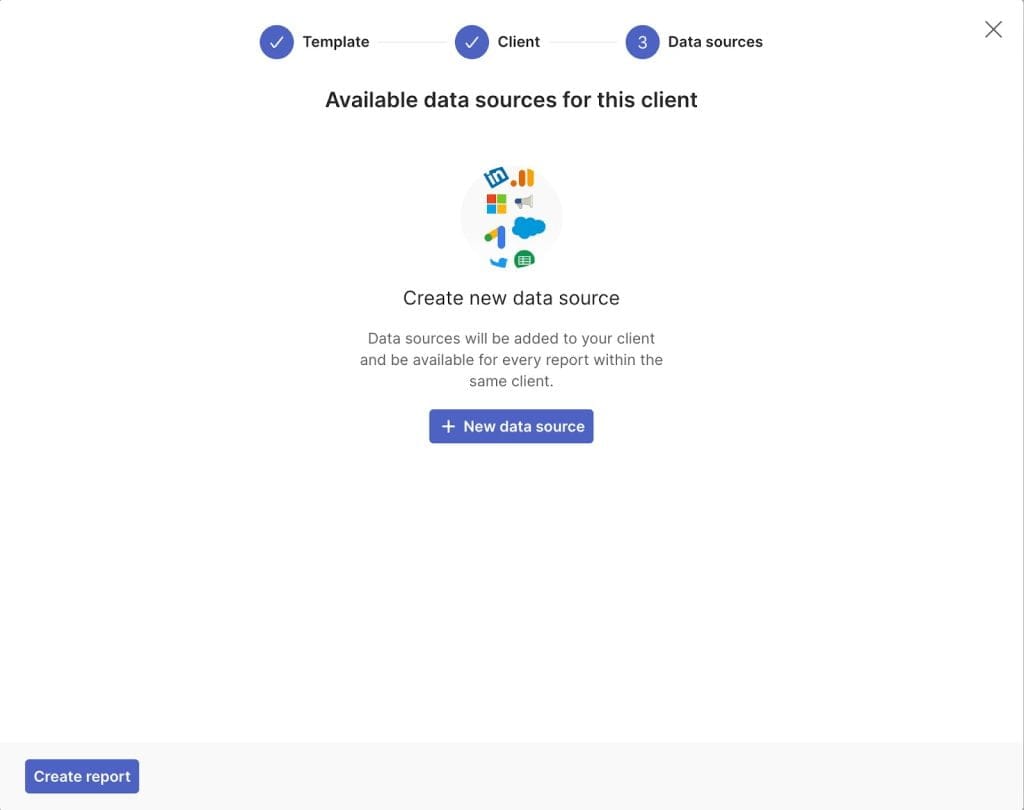
We then need to choose our data source, so click the “+ New data source” button.
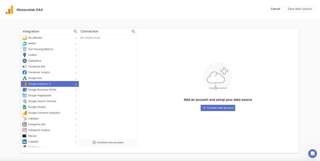
Scroll down to Google Analytics 4 in the integrations list and then click “+ Connect new account”.
Then click “Connect Google Analytics 4”.
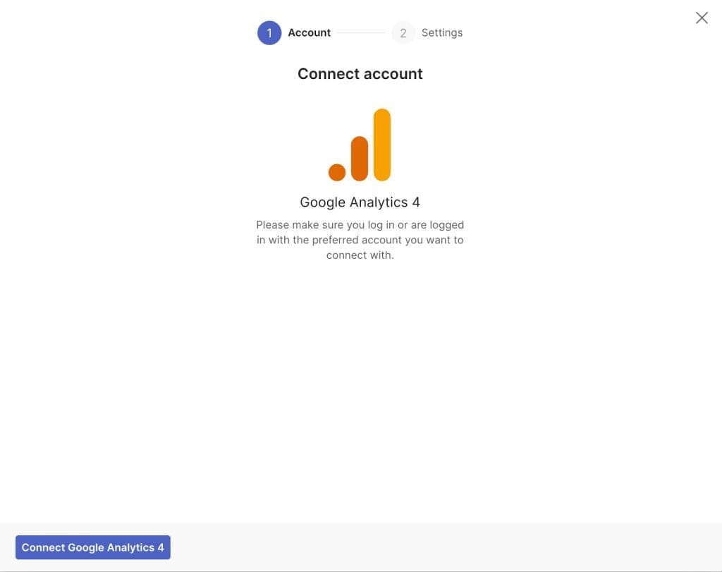
You then need to go through the Google authentication/approval process to allow Swydo to connect to your GA4 data. Once you have done this, you will see your new data source ready to use to create your own GA4 report.
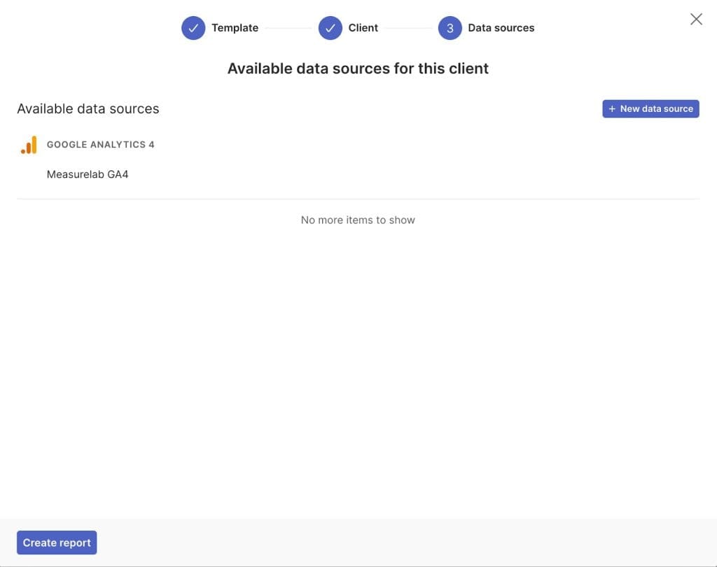
At first, you will see this blank report screen, ready for you to add your widgets and KPIs to visualize the GA4 data you are most interested in.
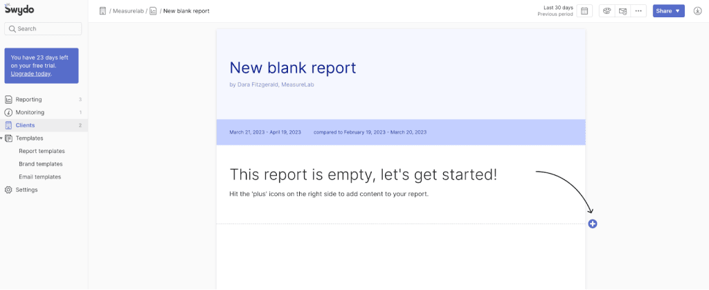
Working with GA4 data in Swydo
For this article, I will use our Measurelab data to demonstrate and the report I will build will focus on the training section of our website.
I want to include some high-level metrics (users and pageviews) as well as some macro and micro-conversions (training bookings – our KPI – and enquiry form submissions, video plays, etc. – micro-conversions) and then break these down by some common GA4 dimensions for a more granular view of performance.
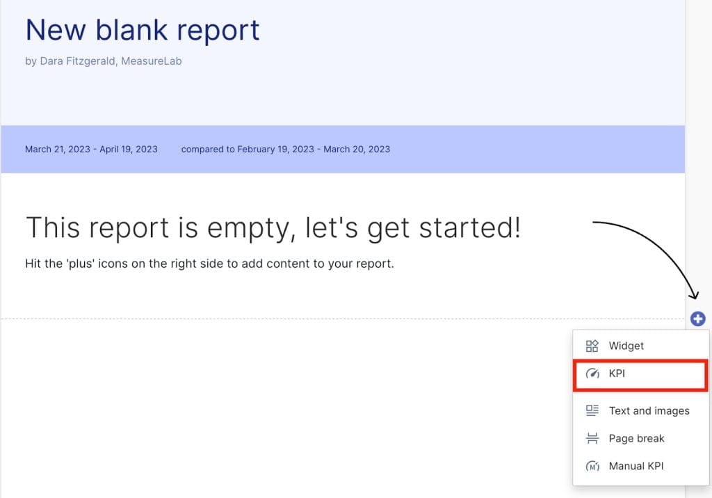
So let’s start by making a scorecard to show the high-level metrics. Click the blue “+” button and then select “KPI” from the options.
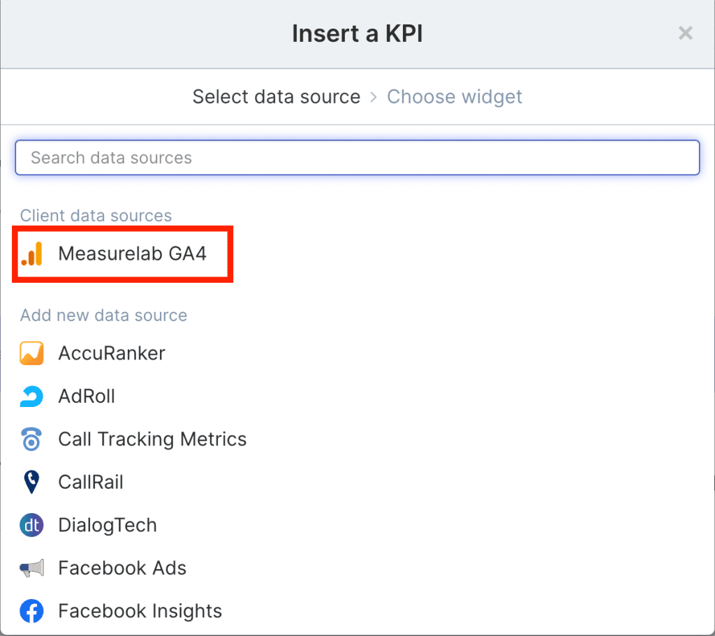
I then need to select the data source I connected to earlier.
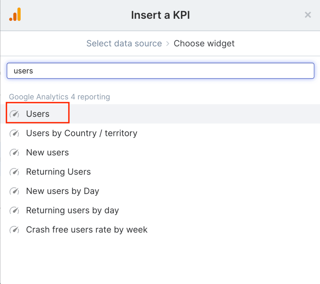
Then I search for and select “Users” in the list.
Adding filters to GA4 reports
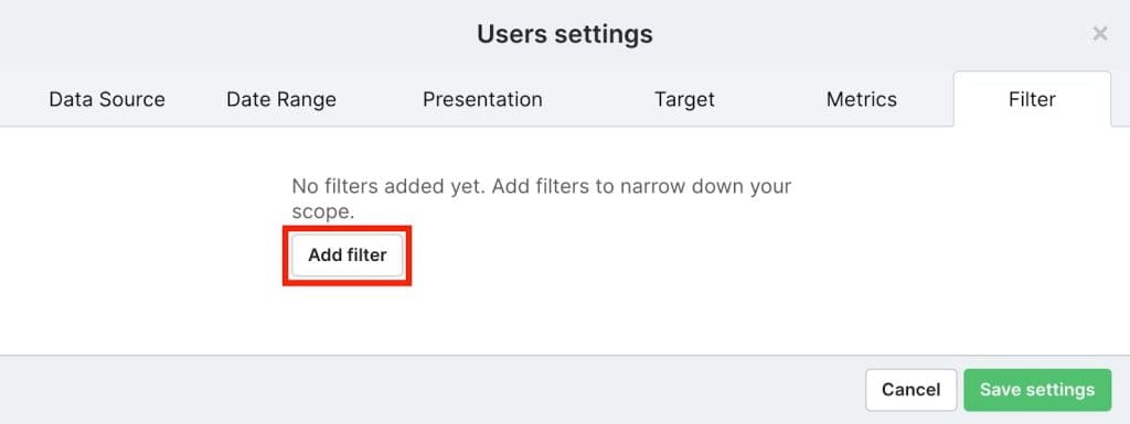
In my case, I only want users that viewed training pages on our site so I need to add a filter in the widget settings.
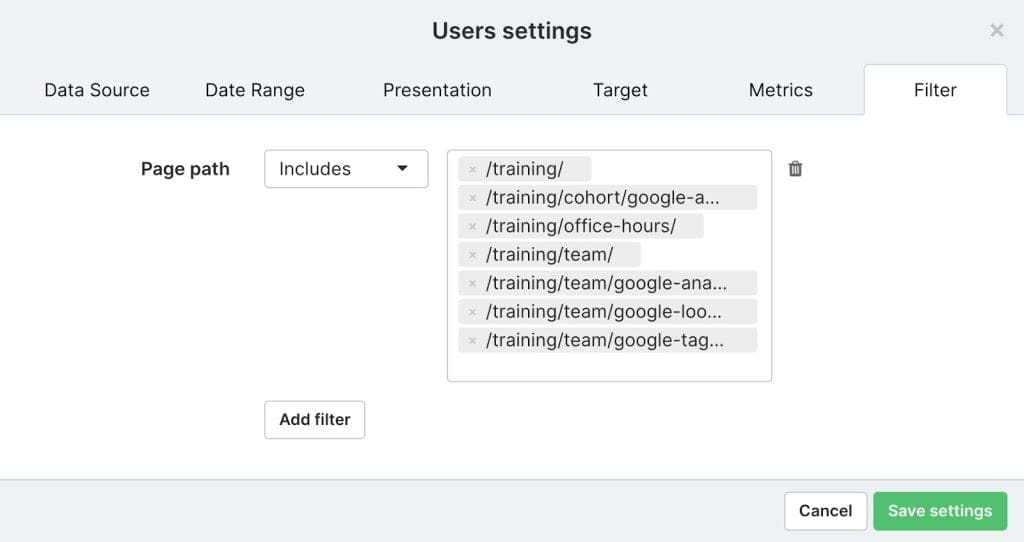
In this case, I add a filter on the “Page path” dimension to only include pages on our website in the training section.
I then repeat this process for all the other metrics I want to show in my scorecard and I end up with this view.
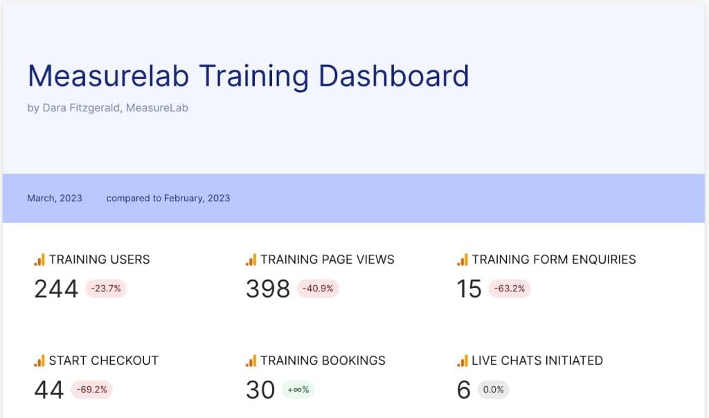
The users and page view widgets both need the filter I showed above to ensure it’s only including those who visit the training section of our website.
The training form enquiry metric is using one of GA4’s enhanced measurement events (which are automatically tracked), called form_submit. The metric used in this widget is “Event count,” and the filter is based on “Event name” including form_submit.
The start checkout, training bookings and live chats initiated metrics are all using manually created events (begin_checkout, purchase and live_chat respectively). In other words, these events were configured manually using Google Tag Manager, as opposed to the automatically collected events which require no manual implementation.
The same approach can be used for any events you are tracking in GA4 and as mentioned in our previous event tracking article it doesn’t actually matter which method you used to create the events – within a reporting context they are all the same. So you can create various different widgets using combinations of the events you are tracking along with the different dimensions available in GA4 to break this data down further for more meaningful analysis.
To give some examples of this, I will build out this dashboard a little further to wrap up this article.
Choosing the correct data visualization
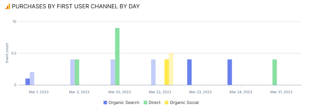
Given the KPI for this dashboard is successful training course bookings, I will first look at purchases by day, split by the users first marketing channel.
First I create a new widget, just as before, but this time in the widget editor I will set the presentation visual to “Column chart”.
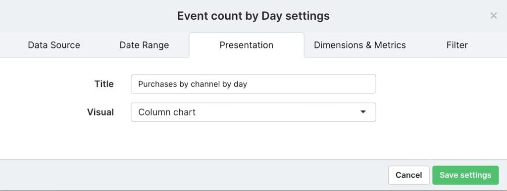
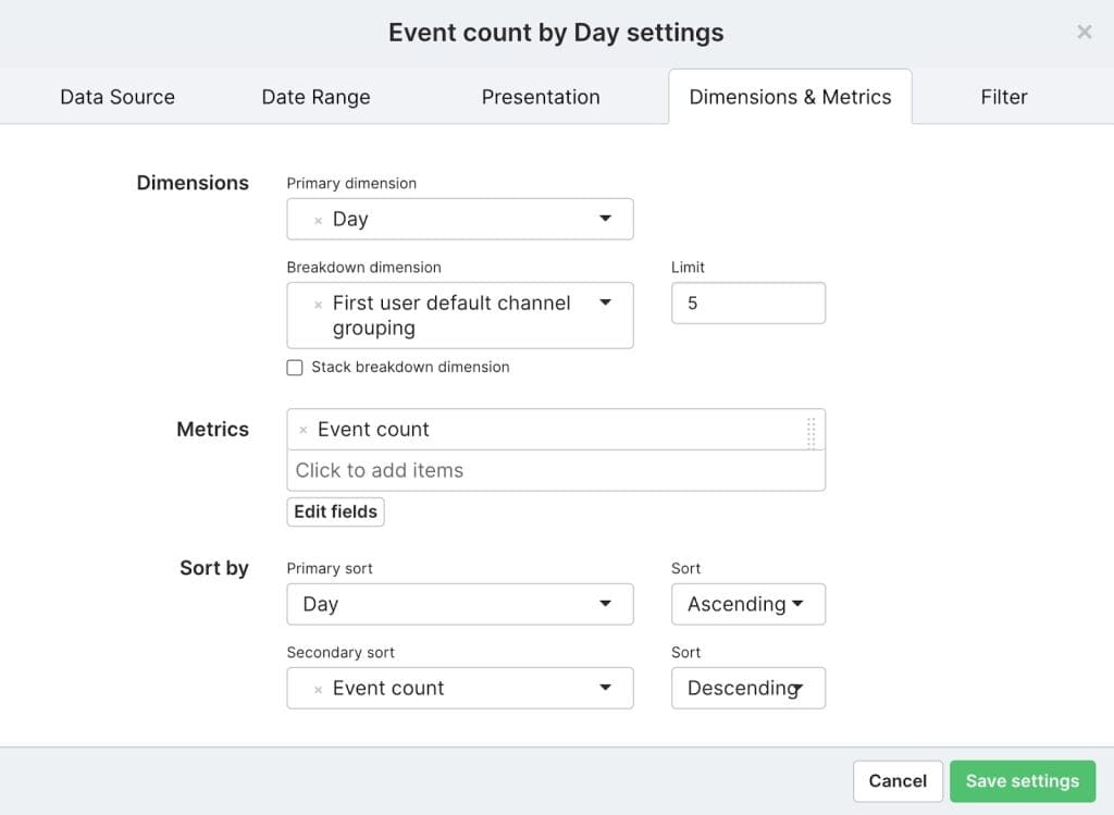
In the Dimensions & Metrics tab I choose “Day” as the primary dimension, with “First user default channel grouping” as the breakdown dimension and the metric I want is “Event count”.
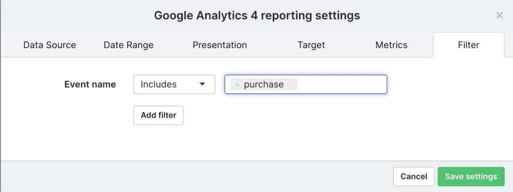
I then need to create a filter so this widget will only report on purchases. Otherwise, we would see the total event count for all events tracked. So in the Filter tab, I create a filter for “Event name” includes “purchase”.
The resulting Column chart looks like this.
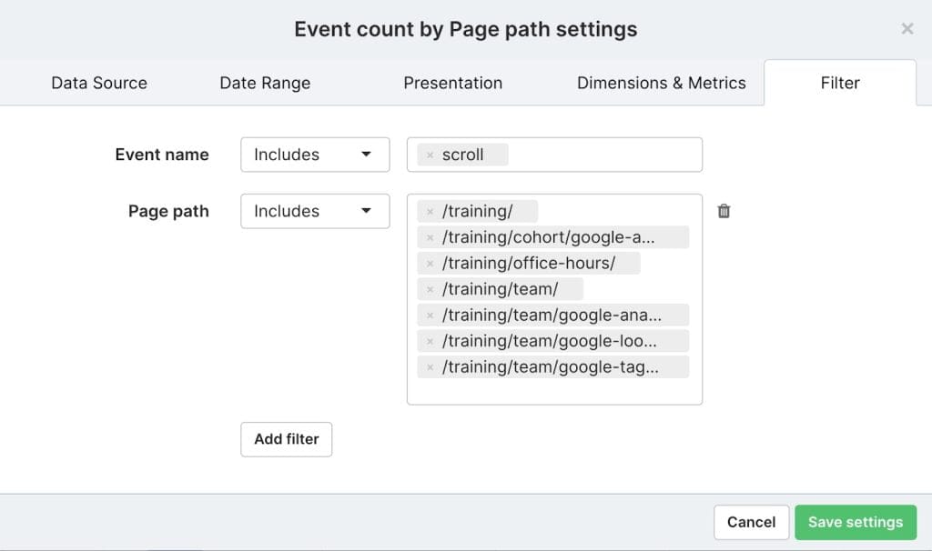
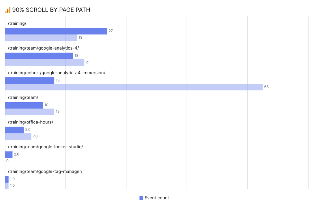
Another enhancement measurement event (automatically tracked in GA4 when enabled) is page scroll. The event named “scroll” triggers each time a user scrolls to 90% of the page depth. So to see how engaged users are with our training pages I will create a widget that looks at 90% scroll by page path.
This time I choose “Bar chart” as the visual in the Presentation tab of the widget editor, then select “Page path” as the dimension and “Event count” as the metric in the Dimensions & Metrics tab. Then on the filter tab, I need two separate filters this time. First I need to include the “scroll” event only and secondly, I need to include training pages only.
I click “Save settings” and the resulting bar chart looks like this.
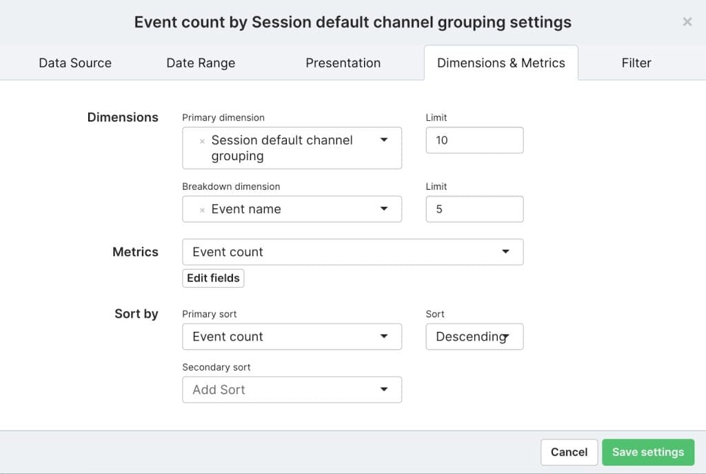
We also have an embedded YouTube video on our main training page and this is tracked using another enhanced measurement event. Any embedded videos that have JS API support enabled will automatically track video_start, video_progress and video_complete events in GA4. In this case I want to include both video_start and video_complete and I want to see this broken down by the marketing channel for the session where the video was interacted with.
For this widget I will select a “Heatmap” visual on the Presentation tab of the widget editor. On the Dimensions & Metrics tab I need to select “Session default channel grouping” as the Primary dimension, with “Event name” as the Breakdown dimension. This is because we want to see both video_start and video_complete events. Then I select “Event count” as the metric.
On the Filter tab I need two filters again, one to include the video_start and video_complete events only and another to include the main training page (/training/) only.
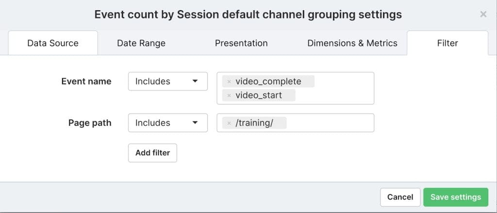
I click “Save settings” and here is my Heatmap widget showing video interactions by session channel.

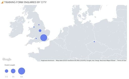
One final widget I will add to this dashboard is to show training enquiry form submissions by city.
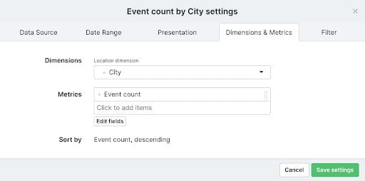
For this widget I would like to visualise it on a map so I will select “Bubblemap” on the Presentation tab. Then on the Dimensions & Metrics tab, I select “City” as the Location dimension and “Event count” as the metric.
And on the Filter tab I need to create a filter on the “Event name” to include the event form_submit.
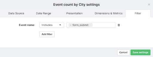
This is yet another (automatically tracked) enhanced measurement event in GA4, which triggers each time a form is submitted on your website. Note: It is always advisable to check any enhanced measurement events you are using to ensure they work correctly on your specific website.
This is the resulting “Bubblemap” widget showing enquiry form submissions by city.
There is obviously a lot more you can do within the Swydo platform itself, including adding additional data sources to your reports so you can measure KPI performance across all of your marketing activity, not just web and app analytics data. Hopefully, this article showed you how easy it is to start building out reports in Swydo using your GA4 data.
In the next and final article in this series, we will recap what we have covered so far on demystifying GA4, as well as updating you on the GA4 changes since we started this series and finally give you some of our key tips and takeaways to make the most of what GA4 has to offer. You may also want to check out this recorded webinar from Measurelab and Swydo experts on frequently asked GA4 questions.

Dara is the CEO of Measurelab. He has specialized in Google Analytics for the last 15 years, consulting clients, running training courses, and speaking at industry events. His mission now is to make Measurelab the world’s favorite digital analytics consultancy and the all-time greatest place to work (for analytics types).


