
Our previous article covered creating a comprehensive marketing report using Google Sheets. While Sheets provides powerful data analysis and visualization tools, it has limitations when scaling and sharing reports with clients. That’s where Looker Studio (formerly Google Data Studio) shines.
Why Migrate from Google Sheets to Looker Studio?
Looker Studio, a free, web-based data visualization and reporting platform, seamlessly integrates with Google Sheets and other data sources. Connecting your existing Google Sheets report to Looker Studio enables you to:
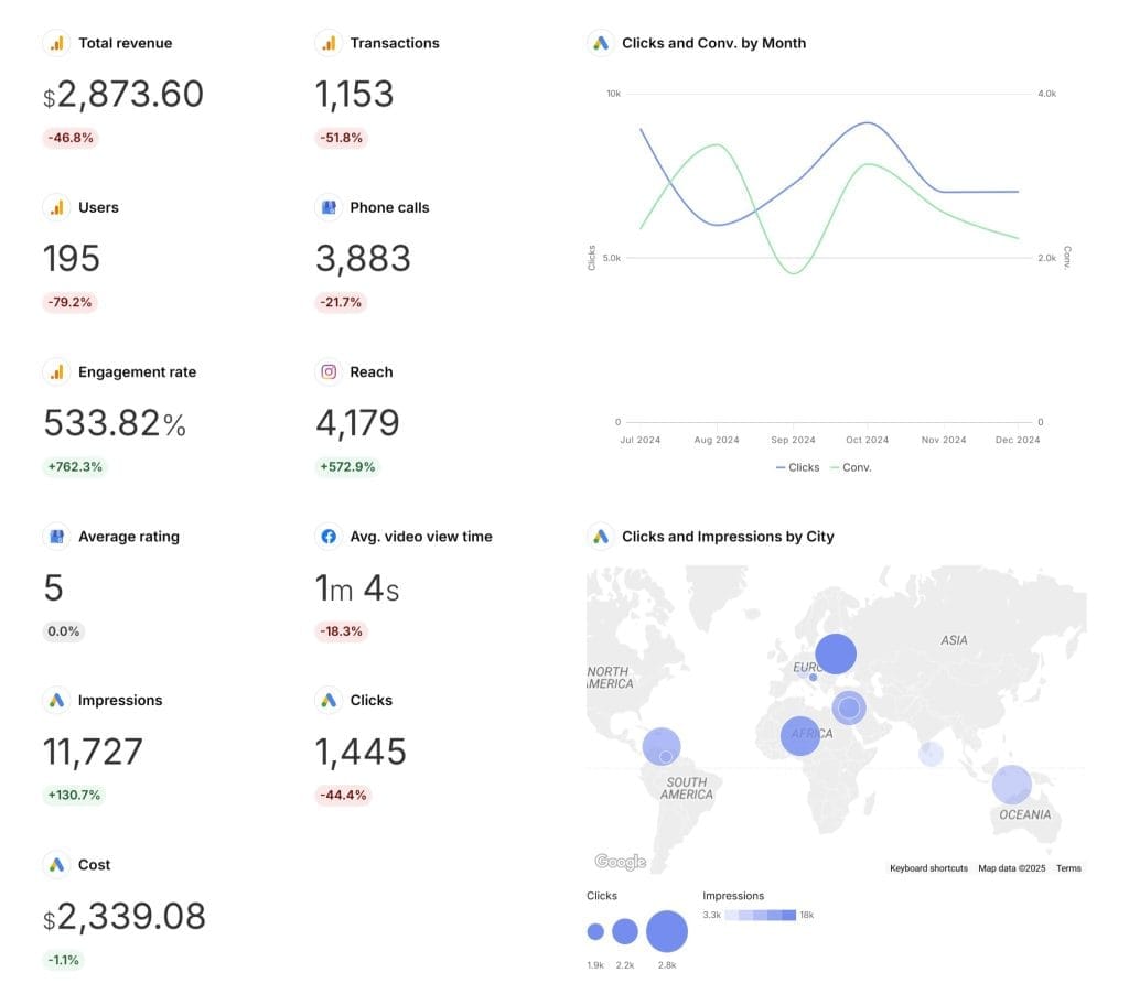
- Create visually appealing reports: Looker Studio provides a wide range of customizable charts, graphs, and dashboards that surpass the basic options in Google Sheets. Impress your clients with professional, branded reports.
- Simplify data management: Instead of juggling multiple sheets and tabs, centralize your data sources and blend them together in one place with Looker Studio. Switch between data sources and create calculated fields without complex formulas.
- Automate data refreshes: Set up automatic data refreshes in Looker Studio to keep your reports up-to-date. No more manual exports or copy-pasting.
- Collaborate and share with ease: Share reports with clients and collaborate with your team using Looker Studio’s simple sharing features. Control access permissions and embed reports on websites or client portals.
- Scale your reporting: As your agency grows and takes on more clients, Looker Studio handles the increased data volume and complexity. Create report templates and customize them for each client.
How to Migrate Your Google Sheets Report to Looker Studio
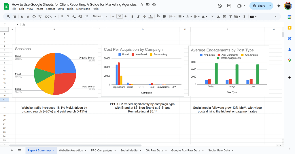
Take the marketing report we built in Google Sheets and recreate it in Looker Studio, using the same example data and visualizations to demonstrate the process.
Step 1: Prepare Your Data Sources
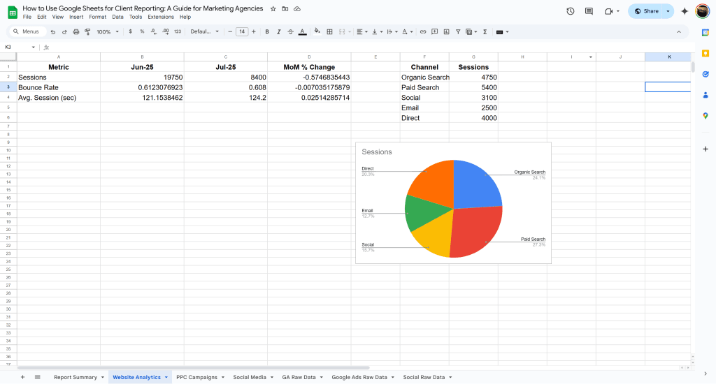
In the Google Sheets report, we separated data into tabs for website analytics, PPC campaigns, and social media. To use this data in Looker Studio:
- Make sure each dataset is in a clean, tabular format with headers in the first row.
- Remove calculated fields, pivot tables, or charts from the sheets.
- Rename the sheets with descriptive names (e.g., “Website Analytics Data”, “PPC Campaigns Data”, “Social Media Data”).
- Share the Google Sheets file with the email address you use for Looker Studio.
Step 2: Create a New Looker Studio Report
- Sign in to Looker Studio with your Google account.
- Click the “Blank” report option under the “Start a new report” section.
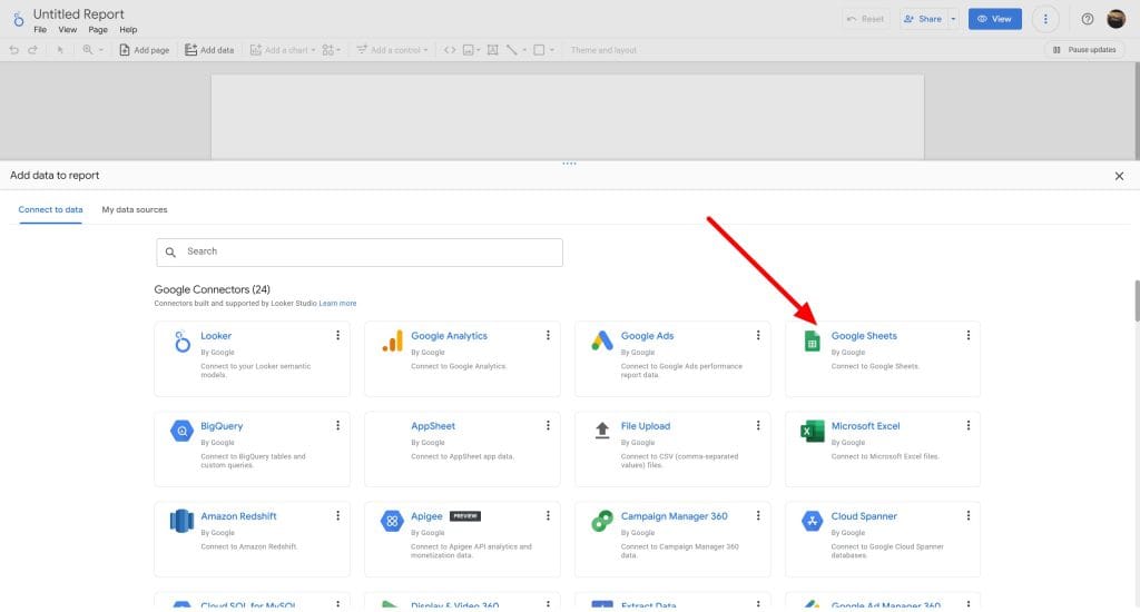
- Search for “Google Sheets” in the list of connectors in the “Add data to report” panel on the right and select it.
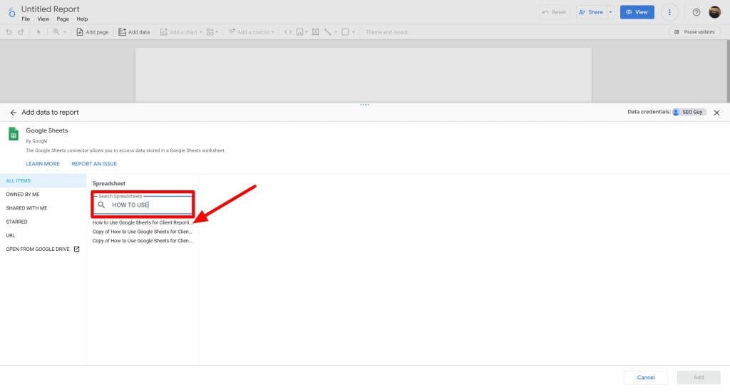
- Choose the Google Sheets file you prepared in Step 1 and click “Connect”.
- Select the sheet with your website analytics data and click “Add to Report”.
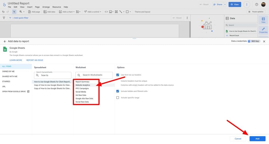
Repeat steps 3-5 for your PPC and social media data sheets. Looker Studio creates a new data source for each added sheet.
For now we will focus on Website Analytics tabs.
Step 3: Verify and Configure Your Data Sources
After adding your data sources, verify that Looker Studio correctly identified the data types for each field.
- Click on each data source in the data source panel on the right to review its fields.
- Check the categorization of dates, numbers, and text fields. If needed, click on a field to change its type or create a new calculated field.
- Rename fields or data sources if needed for better readability and understanding.
- If you plan to blend data from multiple sources, verify the presence of common fields to join on, such as dates or campaign names.
Reviewing and configuring your data sources upfront makes report creation much smoother.
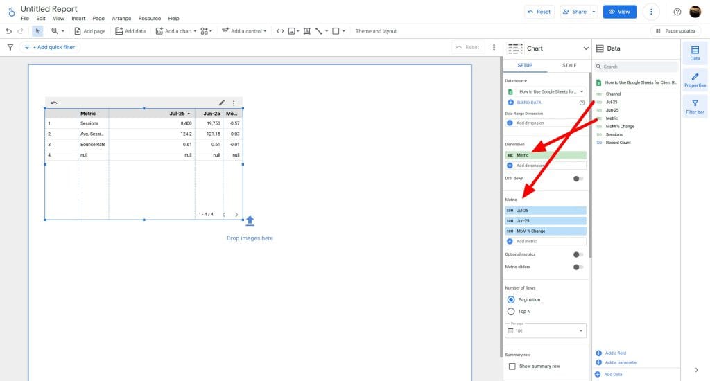
To create a table, you will need to first select the Dimension and the metrics. The Dimensions will be the main Metrics, and the metrics/columns will be the dates and the MoM % Change:
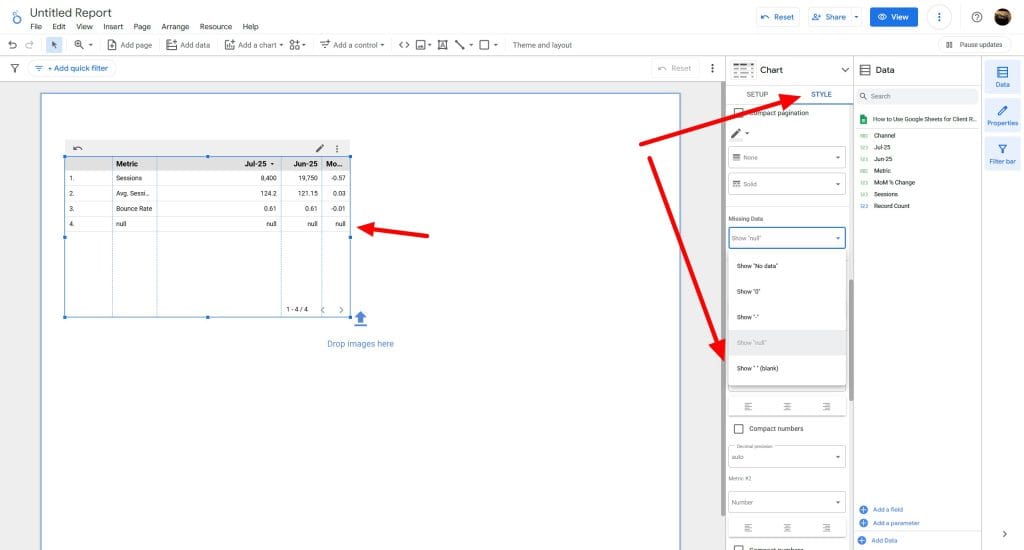
You will most likely see “null”, to remove tit, you can select Style, scroll down to Missing Data and select blank to remove it:
You can add other visuals like a Pie Chart by click on “Add a chart” and select the Pie Chart:
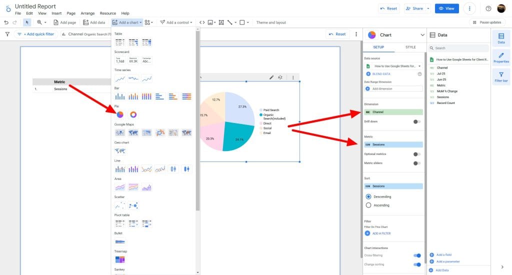
You can select the Dimension (Channel) and Metrics (Session)
Step 4: Build Your Report Layout
Design your report layout on Looker Studio’s blank canvas. Recreate the sections from your Google Sheets report:
- Add a text box for your report title (e.g., “July 2025 Marketing Report”).
- Insert a new page for each main section: Website Analytics, PPC Campaigns, Social Media.
- Use the “Rectangle” shape to create distinct sections within each page.
Consider adding your agency’s logo and using brand colors for a professional look.
Step 5: Create Your Data Visualizations
Recreate the charts and tables from the Google Sheets report in Looker Studio.
Website Analytics
Scorecard for total sessions:
- Drag a “Scorecard” chart onto the page.
- Select the website analytics data source in the data panel.
- Set the metric to “Sessions”.
- Add a date range control and set it to the desired reporting period.
Pie chart for sessions by channel:
- Drag a “Pie” chart onto the page.
- Select the website analytics data source in the data panel.
- Set the dimension to “Channel” and the metric to “Sessions”.
- Style the chart by adjusting colors, fonts, and legend position.
PPC Campaigns
Table for campaign performance metrics:
- Drag a “Table” chart onto the page.
- Select the PPC campaigns data source in the data panel.
- Add the dimensions: “Campaign”, “Impressions”, “Clicks”, “CTR”, “Cost”, “Conversions”, “CPA”.
- Style the table by adding heatmap formatting to metrics like CTR and CPA.
Bar chart for cost per acquisition by campaign:
- Drag a “Bar” chart onto the page.
- Select the PPC campaigns data source in the data panel.
- Set the dimension to “Campaign” and the metric to “CPA”.
- Customize the chart by adjusting series colors, axes, and data labels.
Social Media
Scorecard for follower growth:
- Drag a “Scorecard” chart onto the page.
- Select the social media data source in the data panel.
- Set the metric to the most recent “Followers” value.
- Add a second metric for the previous period’s “Followers” value.
- Set the comparison calculation to show month-over-month percent change.
Bar chart for average engagements by post type:
- Drag a “Bar” chart onto the page.
- Select the social media data source in the data panel.
- Set the dimension to “Post Type” and the metric to “Engagements”.
- Switch to a stacked bar chart in the Style tab to show engagement breakdowns.
- Adjust the chart colors and add data labels.
Step 6: Add Context with Informative Text
Include text boxes with insights, analysis, and recommendations alongside your data visualizations. This narrative helps explain the data story to your clients.
For example, next to the pie chart showing website sessions by channel, add:
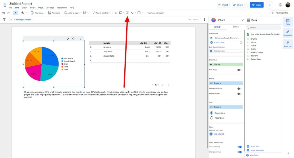
“Organic search drove 45% of all website sessions this month, up from 40% last month. This increase aligns with our SEO efforts to optimize key landing pages and build high-quality backlinks. To further capitalize on this momentum, create an editorial calendar to regularly publish new keyword-optimized content.”
Adding this qualitative context helps clients understand what the numbers mean and what actions to take based on the data.
Step 7: Invite Collaboration and Set Up Sharing
Collaborate on reports directly with colleagues and clients using Looker Studio. To share your report:
- Click the “Share” button in the top-right corner.
- Enter the email addresses of collaborators under “Invite people”.
- Adjust their access level (view or edit) as needed.
- Click “Send” to share the report.
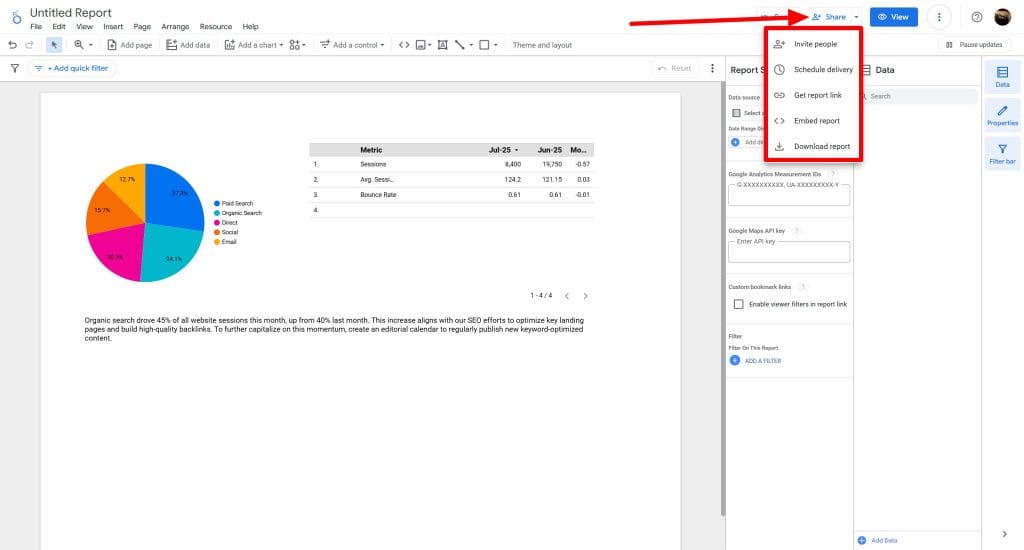
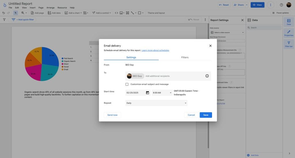
Schedule automated email delivery of the report by going to the “Scheduled email delivery” section in the “Share” dialog and specifying the recipients, frequency, and other options.
To embed your report on a website or portal, go to the “Embed report” section of the “Share” dialog and copy the provided code snippet.
Best Practices and Tips for Looker Studio Reports
Apply these best practices and tips as you build and refine your Looker Studio reports:
- Focus on key metrics: Avoid cluttering your reports with too many metrics. Focus on the KPIs that matter most to your client’s goals.
- Use consistent naming conventions: Establish naming conventions for your data sources, fields, and charts to keep your reports organized and easy to understand.
- Use data controls: Add date range, source, and other data controls to enable users to dynamically filter the data in your reports.
- Blend data thoughtfully: When blending data from multiple sources, double-check your join keys and logic for accuracy.
- Annotate important events: Use Looker Studio’s annotation feature to mark key events, like campaign launches or website updates, directly on time-series charts.
- Take advantage of templates: Explore the template gallery for inspiration or to give yourself a head start. Looker Studio offers a variety of pre-built templates for common reporting use cases.
- Keep accessibility in mind: Make sure that your reports are accessible by using clear fonts, high-contrast colors, and meaningful alt text for charts and images.
Follow these client reporting best practices and iterate on your designs to create Looker Studio reports that effectively communicate marketing results and guide data-driven decisions. Also read our Looker Studio limitations and how to solve them for better client reporting.
Conclusion
Migrate your marketing reports from Google Sheets to Looker Studio to elevate your reporting capabilities and create more value for your agency’s clients. With Looker Studio’s advanced visualization options, interactive features, and collaborative workflow, you can:
- Build professional, branded reports that clients love
- Streamline your data management and analysis processes
- Surface key insights and recommendations more clearly
- Scale your reporting as you onboard more clients
And when you’re ready to take your reporting to the next level with even greater automation and client management features, consider a client reporting platform like Swydo. You’ll be able to scale your reporting even further as you onboard more clients.