
Quantitative data is information you can count — clicks, conversions, revenue, survey scores. Qualitative data is information you interpret — interview answers, session recordings, the comment a customer leaves under a one-star review. One tells you what happened. The other tells you why.
You present a client with a 23% jump in click-through rate, and they shrug: “But is it helping sales?” You show them a wall of glowing testimonials, and they ask, “Where are the numbers?” You’ve been on both sides of that conversation. The tension between numbers and stories isn’t a problem to solve once — it’s the daily job.
This guide covers what each data type actually is, when to lead with one over the other, and how to bring both into a client report that earns the renewal. No filler.
What’s the Difference Between Qualitative and Quantitative Data?
Quantitative data answers “how many,” “how much,” and “how often.” Qualitative data answers “why” and “how.” That’s the core split, and the popular shorthand — “numbers vs. words” — is close but too blunt to use on real client work.
A five-star rating is a number, but it sits on top of a feeling. A heatmap is quantitative, yet you read it to understand intent. The useful distinction isn’t the format of the data. It’s the question you’re trying to answer.
Quantitative
The “What”
Format
Numbers, measurements, statistics
Answers
How many? How much? How often?
Collection methods
Surveys, analytics, experiments, A/B tests
Sample size
Large — built for statistical significance
Analysis
Statistical, mathematical
Best for
Measuring, testing, validating, tracking trends
Qualitative
The “Why”
Format
Words, observations, images
Answers
Why? How? What does this mean?
Collection methods
Interviews, observation, focus groups, content analysis
Sample size
Small — depth over breadth
Analysis
Thematic, interpretive
Best for
Exploring, understanding, generating hypotheses
Quantitative Data, the “What”
Quantitative data is structured and countable, which makes it easy to compare, chart, and track over time. In agency work, that’s website traffic and conversion rates, ROAS and CPC, retention percentages, Net Promoter Score, market share, purchase frequency.
It splits further into discrete and continuous data, whole counts like “number of purchases” versus measured values like “time on page”, and that distinction shapes which chart you reach for. The strength of quantitative data is scale: it tells you what’s happening across thousands of people with statistical confidence. The weakness is that it rarely tells you why.
Qualitative Data, the “Why”
Qualitative data is descriptive and contextual. It captures meaning, motivation, and the messy reasons behind the numbers. In agency work, that’s customer interviews, open-ended survey responses, session recordings of someone struggling at checkout, support tickets, sales-call transcripts, the language people use in reviews.
When a conversion rate drops and nobody on the team can explain it, qualitative research is what closes the gap. Five customer interviews can surface a trust problem on a redesigned checkout that no funnel report would ever flag. Numbers point at the symptom. Qualitative work finds the cause.
Why Both Matter for Your Agency in 2026
Clients now expect the number and the reason behind it, and the agencies winning bigger retainers are the ones who deliver both in the same breath. There’s a business case under this, not just a philosophical one.
Forrester’s research on customer experience found that customer-obsessed organizations report roughly 41% faster revenue growth, 49% faster profit growth, and 51% better customer retention than companies that aren’t, yet only a tiny share of organizations actually qualify as customer-obsessed. You can’t reach that level of customer understanding on dashboards alone. Dashboards tell you behavior changed. Only qualitative work tells you what your customer was thinking when it did.
There’s a sharper, 2026-specific reason too. Consent banners and cookie restrictions mean a large slice of EEA and UK traffic now opts out of tracking, and platforms increasingly fill the gap with modeled conversions rather than observed ones. As attribution models lean harder on estimation, the qualitative signal — what customers say, where they hesitate, why they bought — becomes some of the most reliable ground truth an agency still has direct access to. That’s a real shift, and most reporting hasn’t caught up to it.
Here’s the opinion that follows from all this: a dashboard that shows what happened but never why isn’t a report. It’s a liability. Filling a deck with vanity metrics and no interpretation tells your client you can pull numbers, not that you understand their business. The second thing is what they pay a premium for.
When to Use Qualitative vs. Quantitative Research
Lead with quantitative when you need to prove, test, track, prioritize, or budget. Lead with qualitative when you need to explore, understand a “why,” shape brand strategy, or find an opportunity nobody’s named yet. Most client work needs both — the question is which one goes first.
Lead With Quantitative When…
- You need to prove ROI or campaign performance
- You’re testing specific elements with A/B tests
- You’re tracking performance trends over time
- You’re sizing and prioritizing opportunities
- You’re making data-driven budget decisions
Lead With Qualitative When…
- You need to understand why customers behave a certain way
- You’re exploring new territory or an unknown issue
- You’re developing brand positioning or creative
- You’re mapping the customer journey and its friction
- You need to generate new hypotheses or ideas
When to Lead With Quantitative
Reach for numbers first when the job is justification or measurement. Proving ROI to a skeptical client. Running an A/B test on subject lines or CTA placement. Tracking brand-health metrics quarter over quarter. Sizing two market segments to decide where the budget goes. These are decisions that need statistical weight, and a confident number ends the debate faster than any anecdote.
When to Lead With Qualitative
Reach for qualitative first when you’re in unfamiliar territory or chasing a cause. A cart-abandonment spike with no obvious explanation. A new product category where you don’t yet know what to measure. Brand positioning, where the real material is emotional and lives in how people talk. Customer-journey work, where the friction points only show up when you watch someone hit them. In these moments, depth beats sample size.
How to Combine Both With the Insight Loop
The most useful way to run mixed methods on a client account is a simple four-phase cycle: Explore, Measure, Explain, Act — the Insight Loop. You start with qualitative discovery, measure what you found at scale, return to qualitative to explain the surprises, then act. Then you do it again next quarter.
The Insight Loop
Explore → Measure → Explain → Act, then run it again
- Explore with interviews, session recordings, and open-ended feedback to surface the variables worth tracking.
- Measure those variables with surveys, analytics, and experiments to see how widespread they really are.
- Explain the unexpected results — the segment that converted twice as well, the campaign that flopped — with follow-up conversations.
- Act on a recommendation you can actually defend, because it’s backed by the number and the reason.
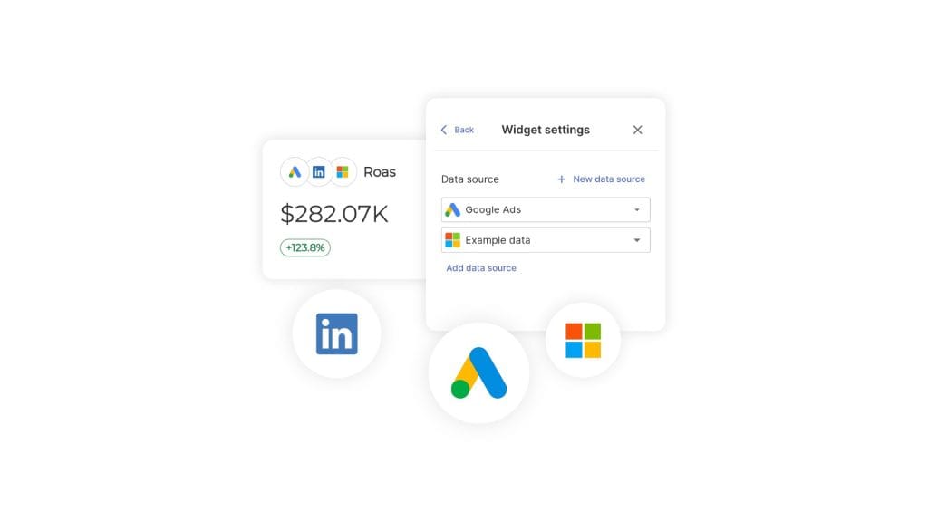
The Measure phase is where multi-channel reporting earns its keep. Instead of pulling Google Ads, Meta, and Microsoft Ads into three separate tables, blend up to five ad platforms into a single widget with Combined Data Sources, so cross-channel ROAS and spend sit side by side in one view. One number, every channel, no manual math.
If you want the academic version, researchers call the deliberate pairing of behavioral data, what people say, and what they actually do “triangulation” — and the four common designs map cleanly onto marketing work:
| Design | How it works | When to use it |
|---|---|---|
| Exploratory sequential | Qualitative first, then quantitative measurement | New markets, new offerings, unknown territory |
| Explanatory sequential | Quantitative first to spot patterns, then qualitative to explain them | Surprising performance, conversion problems |
| Convergent parallel | Both at once, then compare | High-stakes campaigns, full brand audits |
| Embedded | One method nested inside the other | Adding depth to a survey, or structure to interviews |
How to Collect Better Data
Good data collection comes down to matching the method to the question and respecting your respondents’ time and attention. The gap between agencies isn’t access to tools — it’s discipline about which tool to use when.
Quantitative Methods That Hold Up
Move past basic satisfaction surveys. Max-diff scaling forces people to prioritize features instead of rating everything a 7. Conjoint analysis finds the feature-and-price combination that actually sells. Custom tracking parameters and multi-platform attribution reveal real conversion paths instead of last-click guesses.
Keep surveys short. SurveyMonkey’s analysis of around 100,000 surveys found abandonment climbs once a survey runs past seven to eight minutes, with completion dropping anywhere from 5% to 20% — and it slips further with each extra question. A focused five-question survey beats a thorough twenty-question one that nobody finishes. Write a clear hypothesis before every test, too, so you’re building a record of what’s true, not a pile of after-the-fact rationalizations.
Qualitative Methods That Reveal the Truth
People are bad at describing their own behavior. They’ll tell you they read every privacy policy and never impulse-buy, then do the opposite an hour later. So watch what they do, don’t just ask.
One-on-one interviews surface decision logic and emotional reactions a survey can’t reach — talk to current customers, and talk to the prospects who didn’t convert. Observation and think-aloud user testing show you the friction in real time. Content analysis mines the qualitative data your client already owns: reviews, support tickets, social comments, sales calls. That last bucket is usually sitting untouched, and it’s gold for mapping the customer conversion journey.
AI Tools for Qualitative Analysis in 2026
AI has made qualitative analysis fast enough for everyday client work — it handles transcription and first-pass coding, while you handle the judgment. Qualtrics’ 2026 research found that around 95% of researchers now use AI in some form, and the tasks it absorbs first are exactly the ones that used to make qualitative research too slow to bother with: transcribing interviews, tagging open-ended responses, surfacing recurring themes across hundreds of comments.
That changes the math for a mid-sized agency. Work that once took weeks now takes an afternoon, which means qualitative insight can go into a monthly report, not just an annual brand study.
A rough map of where each tool fits:
| Job | Tools that fit |
|---|---|
| Interview & call transcription | Otter, Descript, Fathom |
| Repository and theme synthesis | Dovetail, Notably, Condens |
| Open-text survey analysis | Hotjar, Qualtrics |
| Review and social mining at scale | Thematic |
One caution, because it matters: AI auto-coding is a strong first draft, not a finished analysis. Independent testing of automated theme detection still shows meaningful error rates, and models tend to over-cluster or miss the subtle theme that turns out to be the important one. Let the AI propose the themes. You decide which ones are real and what they mean. The technology tells you what shows up often; only you can tell a client why it matters.
How to Turn Both Into Client-Ready Reports
The deliverable that wins renewals pairs every key number with its reason and a recommendation — a pattern worth building every report around: an Insight Card. One metric, one “why,” one “so what.” That’s the unit of a report a client actually reads.
Insight Card
One metric · one reason · one recommendation
What — the number
Checkout conversion rate
18% MoM
Why — the reason
“I wasn’t sure the payment page was legit, so I bailed and bought it on Amazon instead.”
Source: 5 user interviews + 40 session replays of abandoned checkouts
So What — the recommendation
Restore the trust badges and SSL seal removed in last month’s redesign, then re-test conversion over the next two weeks.
Here’s how that comes together in a report. Enter a Net Promoter Score, a CSAT figure, or a count of coded interview themes as a Manual KPI, so offline and qualitative-derived numbers sit on the dashboard next to the platform metrics.
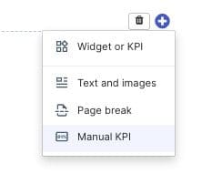
Then drop the verbatim customer quote into a Text widget right beside the conversion-rate KPI it explains, so the number and the reason share the same row instead of living in two different documents.
For the “so what,” let Swydo AI draft the written summary — its Wins, Issues, and Recommendations prompts turn the combined picture into plain language, and the summary can drop straight into the scheduled report email so clients get the story, not just the file.
Be clear about what a reporting platform does and doesn’t do here. Swydo won’t run your interviews or auto-code a stack of transcripts — that part stays with you and your AI tools of choice. What it does is give those findings a home next to the numbers, so the score, the quote, and the written takeaway live in one report instead of three separate files. That’s the gap most reporting leaves open, and it’s the whole point of data storytelling.
Structure the report in layers so each reader gets what they need. Open with an executive summary of business impact, then quantitative performance, then a short Voice-of-Customer block, then the recommendations. Pick the marketing KPIs your client cares about for the top of that stack, and follow your usual client reporting best practices for everything below it. Ten data sources are included on the flat rate, which covers most agencies’ first two or three clients — enough to build this report structure on real accounts before you scale it.
Common Mistakes Agencies Make
Four mistakes show up over and over, and each one is avoidable:
- Reporting the “what” with no “why.” A dashboard of metrics and zero interpretation reads as data entry, not strategy. Pair the number with a reason.
- Cherry-picking quotes. One flattering testimonial isn’t qualitative research. Code the full set of feedback and report the pattern, even when the pattern is uncomfortable.
- Treating modeled conversions as observed fact. With consent loss inflating estimated data, label what’s modeled and lean on first-party qualitative signal to sanity-check it.
- Shipping AI auto-themes unchecked. The model’s first pass is a draft. Review it before it reaches a client, or you’ll defend a “theme” that was a clustering artifact.
Qualitative vs. Quantitative Data FAQ
Direct answers to the questions marketers and agencies search most
Quantitative data is numerical — it counts and measures things like conversion rate, revenue, and traffic, and answers how many, how much, and how often. Qualitative data is descriptive — it captures meaning and motivation from sources like interviews, reviews, and open-ended feedback, and answers why and how.
The quickest test is the question you’re asking. Quantitative tells you 30% of customers abandon checkout; qualitative tells you they leave because the payment page feels unsafe. One reports the behavior, the other explains it.
| Quantitative | Qualitative | |
|---|---|---|
| Answers | How many? How much? How often? | Why? How? What does it mean? |
| Format | Numbers, measurements, statistics | Words, observations, recordings |
| Best for | Measuring, testing, tracking trends | Exploring, understanding the “why” |
Quantitative examples include conversion rate, ROAS, revenue, email open rate, retention rate, NPS, and market share. Qualitative examples include interview transcripts, user-testing recordings, product reviews, support tickets, focus groups, and social comments.
Many sources give you both at once. A survey with rating scales (quantitative) and a comment box (qualitative), or an analytics dashboard (quantitative) sitting next to session recordings (qualitative), captures the number and the reason behind it in one place.
A survey can be both — it depends on the question type. Rating scales, multiple choice, and yes/no questions produce quantitative data, while open-ended text boxes produce qualitative data.
That’s what makes surveys so efficient: one form can deliver a number you can chart and the reason behind it in the same response. The same logic applies to NPS — the 0–10 score is quantitative, and the “why did you give that score?” follow-up is qualitative.
Both are types of quantitative data. Discrete data is counted in whole units — number of purchases, sign-ups, or clicks. Continuous data is measured on a scale and can take any value — time on page, revenue, or page-load speed.
The distinction shapes which chart you reach for: discrete counts suit bar charts, while continuous measurements suit line graphs and trend lines.
Yes. Qualitative data can be turned into quantitative data by coding it — tagging each response by theme and counting how often each theme appears.
Tag 200 open-ended reviews by topic, count the themes, and you’ve turned words into a chart without losing the meaning behind them. That coded count is exactly the kind of figure worth putting on a client dashboard.
Neither is more reliable — they’re reliable for different jobs. Quantitative data gives you statistical confidence across a large group; qualitative data gives you dependable insight into the motivation and context that numbers can’t capture.
The most trustworthy picture comes from using each for what it does best and letting them check each other. When the number and the reason point the same direction, you can defend the decision that follows.
Use quantitative research when you need to prove, test, track, or prioritize — proving ROI, running an A/B test, or monitoring trends over time. Use qualitative research when you need to explore, explain a “why,” or shape strategy — investigating a surprise drop, developing brand positioning, or mapping customer friction.
In short: reach for numbers when the job is measurement, and for words when the job is understanding.
It depends on what you already know. Start with qualitative when you don’t yet know what to measure — it surfaces the variables worth tracking. Start with quantitative when you have a clear hypothesis to validate at scale.
The strongest approach runs them in a loop: qualitative to discover what matters, quantitative to measure how widespread it is, then qualitative again to explain the surprises before you act.
Mixed methods research deliberately combines qualitative and quantitative data so each covers the other’s blind spots — a practice researchers call triangulation. The numbers show what’s happening; the words explain why. Four common designs map cleanly onto marketing work:
| Design | How it works | Best for |
|---|---|---|
| Exploratory sequential | Qualitative first, then quantitative | New markets or offerings, unknown territory |
| Explanatory sequential | Quantitative first, then qualitative to explain | Surprising results, conversion problems |
| Convergent parallel | Both at once, then compare | High-stakes campaigns, full brand audits |
| Embedded | One method nested inside the other | Adding depth to a survey, structure to interviews |
For a focused topic and a fairly similar audience, around 12 in-depth interviews is usually enough. Foundational research by Guest, Bunce, and Johnson found that 12 interviews captured about 88% of emergent themes, with the basic thematic structure clear after just 6.
For diverse audiences or broad, open-ended questions, plan for more — later reviews put saturation closer to 9–17 interviews. There’s no magic number; you’re done at the point of saturation, when new interviews stop telling you anything new.
Keep it under about seven to eight minutes. SurveyMonkey’s analysis of roughly 100,000 surveys found that completion rates start dropping once a survey runs past that point, and they slip further with each extra question.
A focused five-question survey almost always beats a thorough twenty-question one that nobody finishes. Decide the single decision the survey needs to inform, then cut every question that doesn’t serve it.
Code it, then look for themes. Tag your transcripts or responses with short labels, group related labels into broader themes, watch for repetition and emotional intensity, then connect each theme to a decision the client can act on.
AI can handle the first coding pass and speed up transcription, but the interpretation — deciding which themes are real and what they mean — stays human. Tools tell you what shows up often; only you can tell a client why it matters.
Quantify qualitative feedback by coding it: define a set of themes, tag each response with the themes it contains, then count how often each one appears. The result is a frequency you can chart like any other metric.
That’s how a stack of open-ended reviews becomes a line like “42% of unhappy customers mention checkout trust” — a number a client takes seriously, backed by the exact words that produced it.
Quantify what you can and quote the rest. Turn coded theme counts, NPS, or CSAT into scorecards so qualitative-derived numbers chart like any other metric, then place a short verbatim customer quote right beside the KPI it explains.
The goal is one glance that delivers both the number and the human reason behind it — not a separate “research appendix” nobody opens. The simplest pattern is the Insight Card: one metric, one reason, one recommendation.
As privacy rules and cookie restrictions push platforms toward modeled (estimated) conversions instead of observed ones, the things customers tell you directly — why they bought, where they hesitated — become some of the most reliable ground truth you still have direct access to.
When attribution leans on estimation, qualitative signal is the check that keeps a report honest. Label what’s modeled, and use first-party customer feedback to sanity-check it.
The four most common are reporting the “what” with no “why,” cherry-picking flattering quotes, treating estimated conversions as hard fact, and shipping AI-generated themes without review.
Each has a simple fix: pair every metric with a reason, code the full set of feedback instead of the nicest comment, label what’s modeled, and review AI’s first-pass themes before they reach a client. The pattern underneath is that numbers and quotes both need interpretation before they earn a place in a report.
Next Steps
Numbers tell your client what happened. Qualitative work tells them why — and the recommendation that follows is the thing they actually pay for. Start small: pick one client, add a single Voice-of-Customer block to next month’s report, and pair it with the metric it explains.
If you want to build that report on your own accounts, the 14-day Swydo trial doesn’t need a credit card, and unlimited seats mean your whole team can work in it from day one. What would your reporting look like if every key number came with its reason attached?
Turn your research insights into compelling client reports that tell the complete story.
Start Your Free Trial Today